The client wanted a corporate identity and web design created for a new discount code project, to make it easier for people to find the best discount codes and offers. The mission of this website is therefore to save their visitors as much money as possible when shopping online.
Kortingscode is the direct successor of TagCity and stems from the success of the Knack and Le Vif discount code projects. All these are projects designed and developed by Pixili.


We have years of experience with this type of website and have managed to develop a user experience that works. Both TagCity and kortingscode dot knack dot b e are among the biggest Belgian players. The hope is to do the same with kortingscode.
The corporate identity
The corporate identity, just like the web design, is clean, warm, and eye-catching with red as the main color because it is striking and linked to bargains. Then, we used orange and green as accent colors to balance everything.
Deep Carmine
#f43531
Princeton Orange
#f47c31
Lemon Lime
#88a91e
Alabaster Beige
#f5ece5
After some brainstorming and experimentation, it turned out that in Dutch the two O’s in the word “discount code” of “discount” and “code” were very close.
So with a clever typographical trick, I was able to create a semi-hidden percent symbol. A trick used among others in the FedEx logo.
This is very appropriate because, A discount code and the percentage symbol are, in my opinion, inseparable.
Then the frame around the price tag/voucher seems like a nod to its predecessor TagCity, where the logo was a price tag combined with a location symbol.
The price tag can also be used as an arrow.
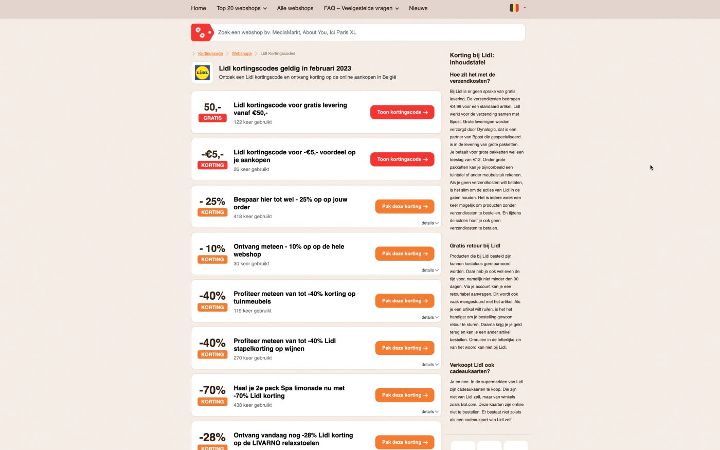
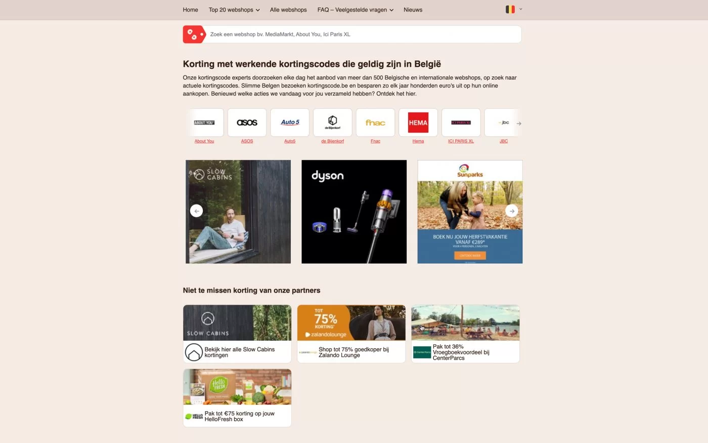
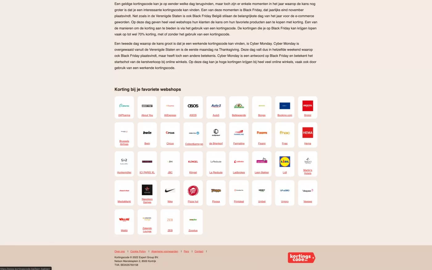
Webdesign
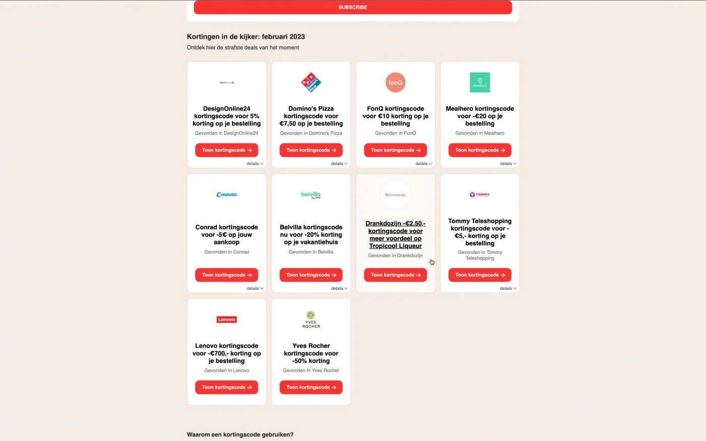
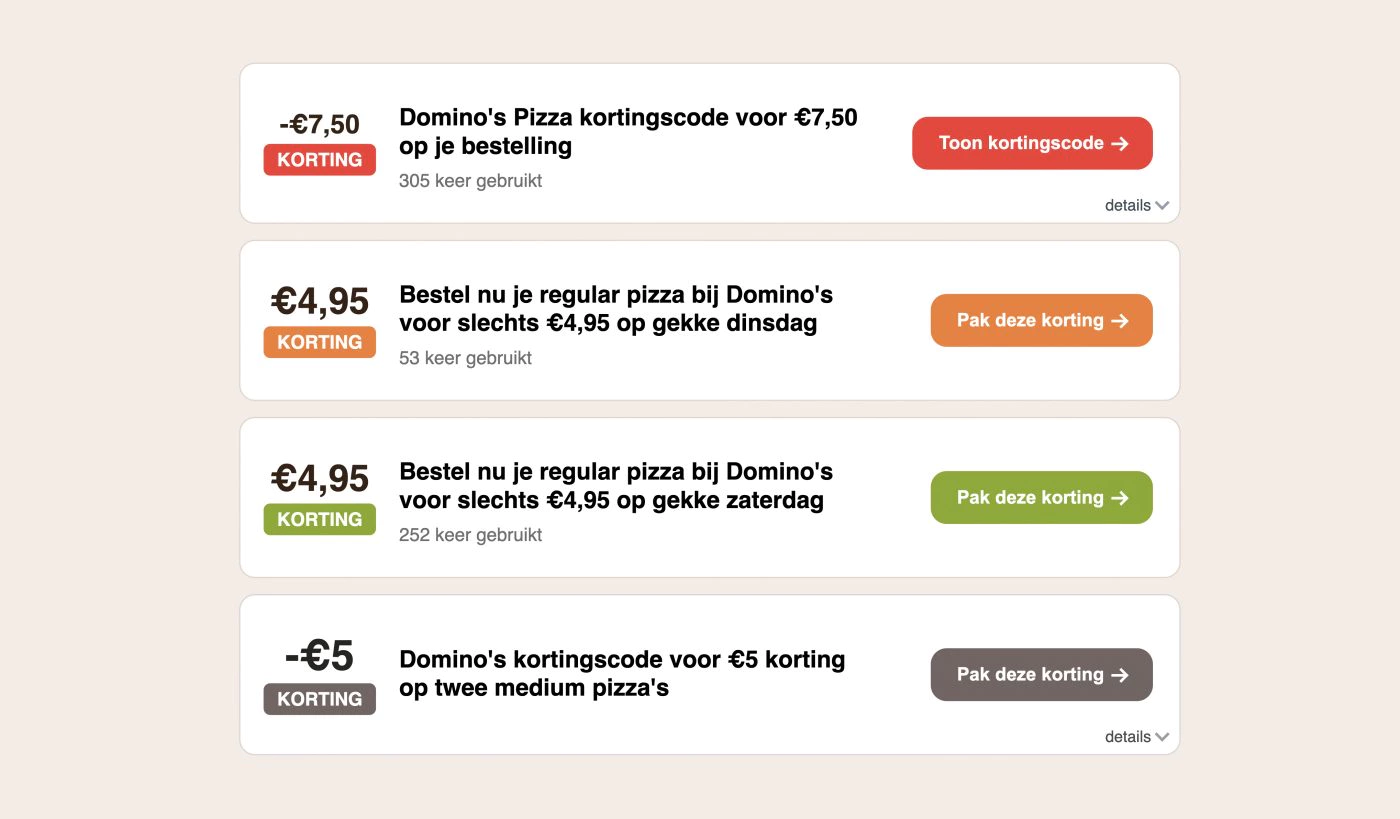
The Tag
The most important and widely used element on discount code sites is the one you click to get the discount. We call it the tag and have experimented and tested different versions of it extensively. And over the years, we feel dat we have perfected this element. We learned that less is more, you have to keep the element recognisable and highlight the discount percentage.
Also, a visual hierarchy is important so that not all tags look the same and better deals stand out.
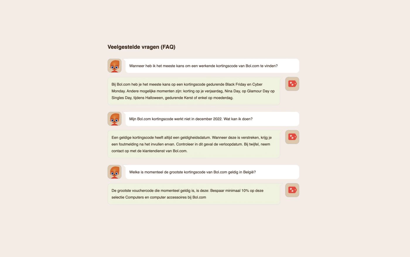
FAQ
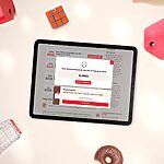
One user element I want to highlight is the frequently asked questions. We took a cool approach to that by visualising it as a dialogue.
And again, we made a nod to its predecessor TagCity. The avatar used for the questioner is Tagy, who was the mascot of TagCity.
Newsletter optin
When designing the opt-in module, care was taken to make it visually appealing. The simple animations incorporated into it help draw attention to the element, thus contributing to more sign-ups.
Super nice job! Totally Corporate Identity and Web Design we were looking for, Thanks :D it's very good as usual!
Pieter-Jan